

Using full size images works in many situations. However, on short screen laptops or landscape format tablets long vertical images may be cut off. If this is a concern, images can be wrapped in DIVs or SPANs (HTML markup) with CSS classes which can be “styled” to cause images to display to a maximum height for those screens.
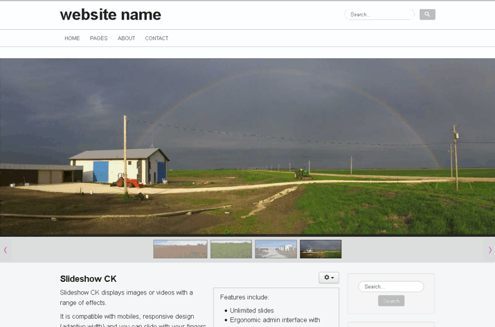
This page uses a Custom Module set to display in the “banner” position only on this page (with Menu Assignment). As mentioned on the LAYOUT page, the banner position is set to display to the full width of the monitor. Hence, how this page displays varies depending on the viewer’s monitor.
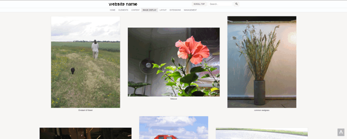
wide screen desktop
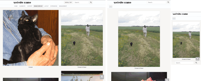
desktop · iPad · iPhone
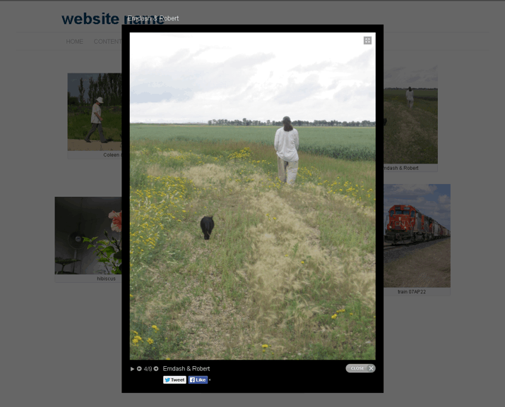
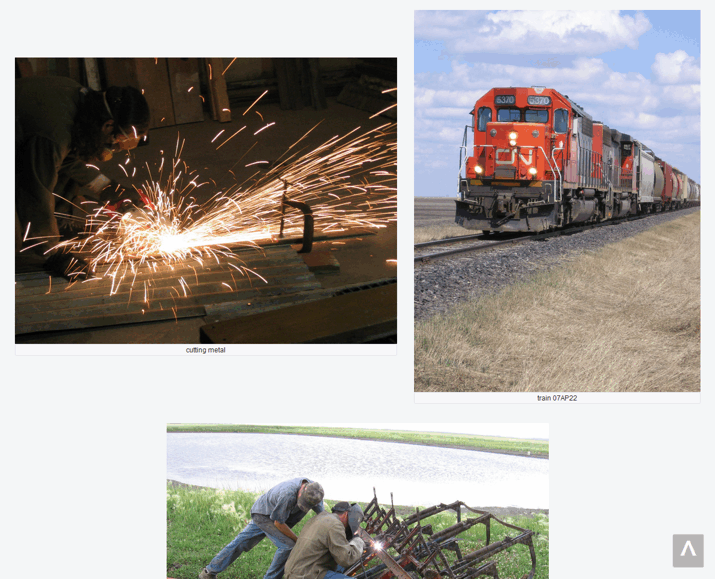
It goes without saying that full size images can be loaded inside of articles.
…
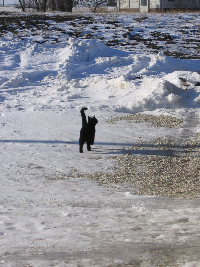
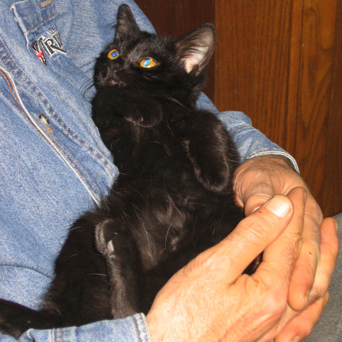
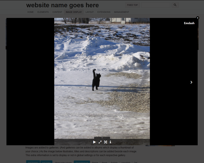
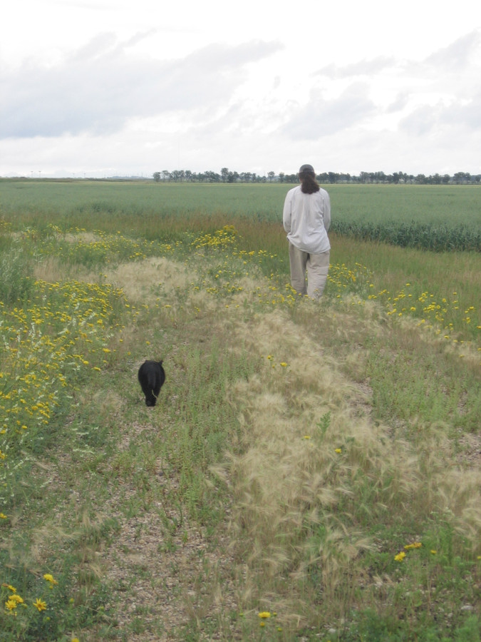 Emdash & Robert
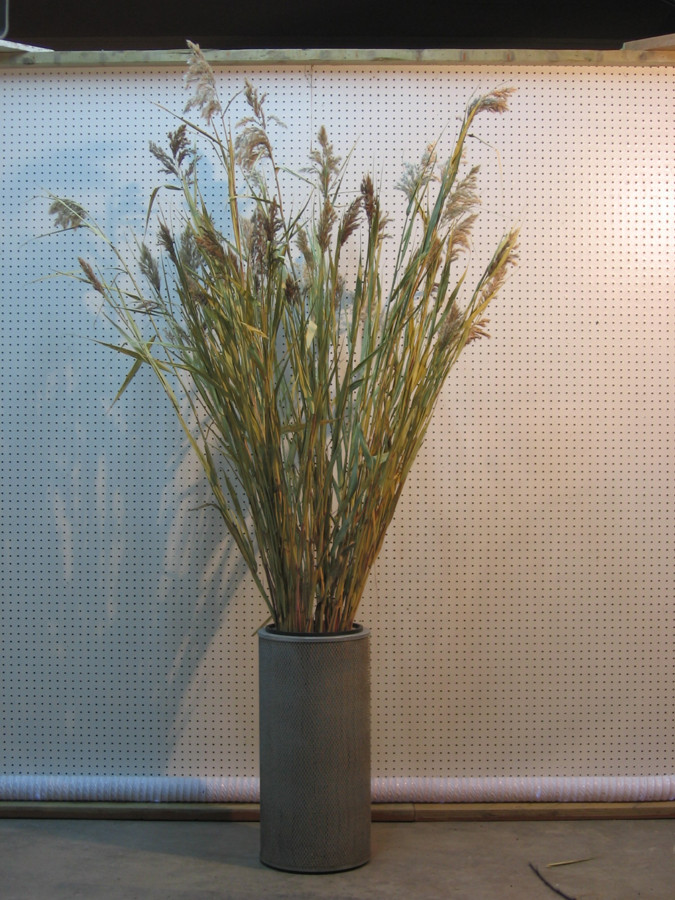
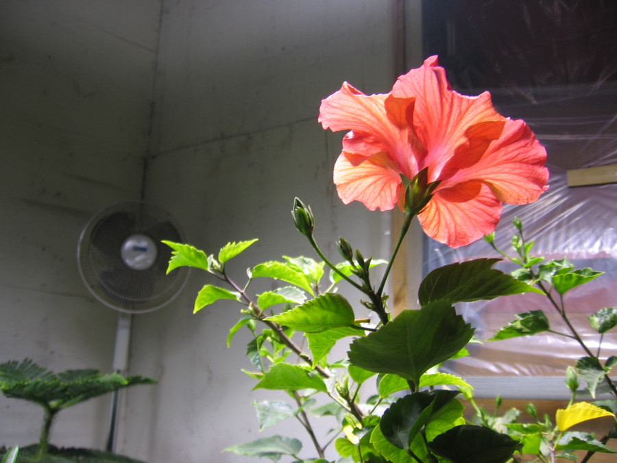 hibiscus
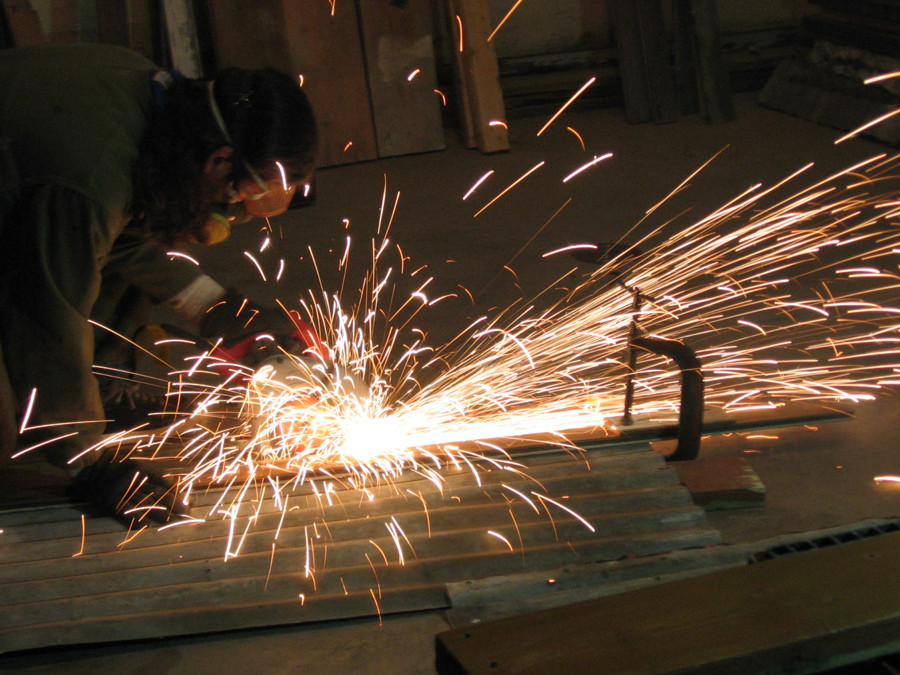
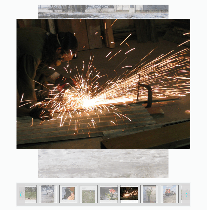
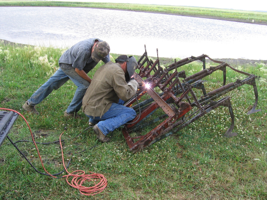 welding cultivator
…

Read more...